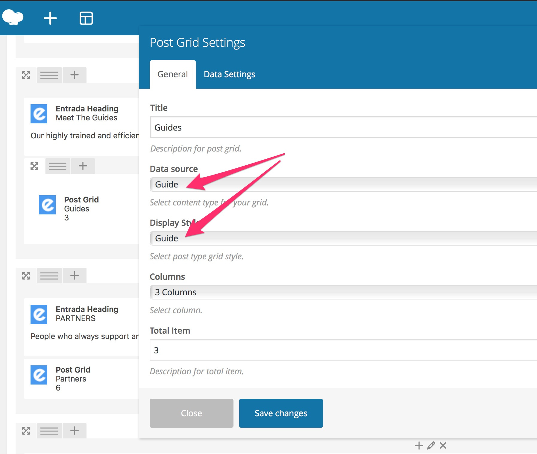
Having trouble with layout when it comes to guide. On my front page I have the guides showing and its perfect. It shows the guides name then the guides title in a clear fashion.

On my guides page it shows as follows. Its much bolder and a larger font size which means that the information is more broken up which pushes the other guides out of the alignment unless I hover over them. How could I fix it so that its the same on both pages?