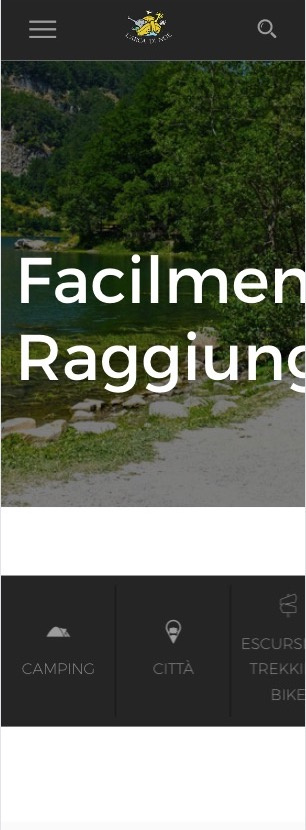
Hi, I have a little problem with menu. when changing display measure, change menu lines too… but appears very very down. it’s possible changing the border of the menu for stay in one line or changing measure for menu mobile/desktop? the menu mobile go from 320px to 990px and desktop menu go from 991px to… it’s possible changing this measure? or alternatively the menu voices in two lines but inside header height? Thanks
ello MrWolf,
Apologies for late response due to holidays, we return to normal work days from 2nd January.
In the meantime, I looked into your query, and I am not sure I fully understand what you are aiming to achieve or the issue you may be facing. If you provide URL or screenshot, that will be helpful.
As for the border of the menu, you can show hide or edit them with CSS, please see these articles:
Hide all borders and lines from main menu
Remove Black Lines from Transparent Menu
Increase Header Height
And for changing the @media rules, you can certainly add it via custom CSS in your entrada-child themes style.css file.
Please let me know if I can clarify any of this further.
Thank you