
Good Morning Sanjeev
I try to hide within the home page elements on mobile phones.
Like the element, that includes the partner columns Entrada Heading PARTNER and Entrada Post Grid.
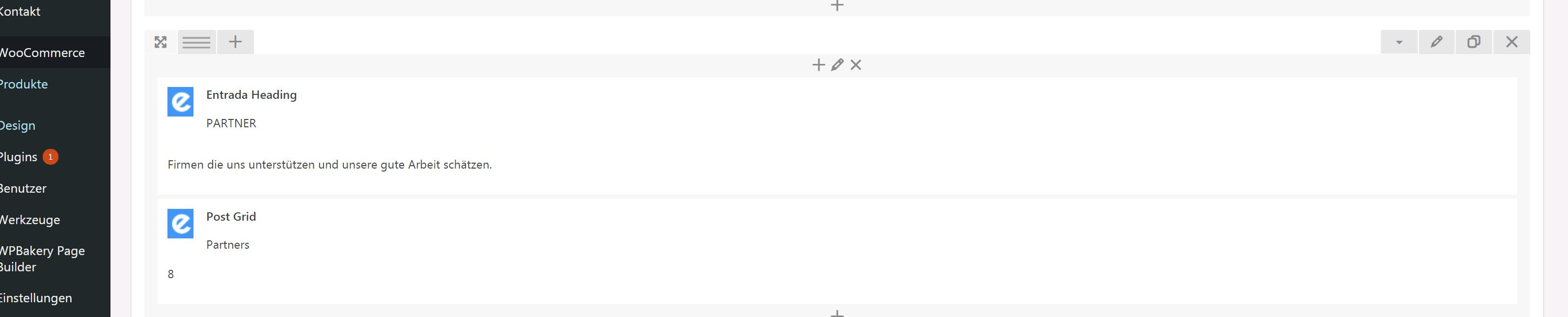
I am able to hide columns at Column Settings, but not the complete element, within WPBakery
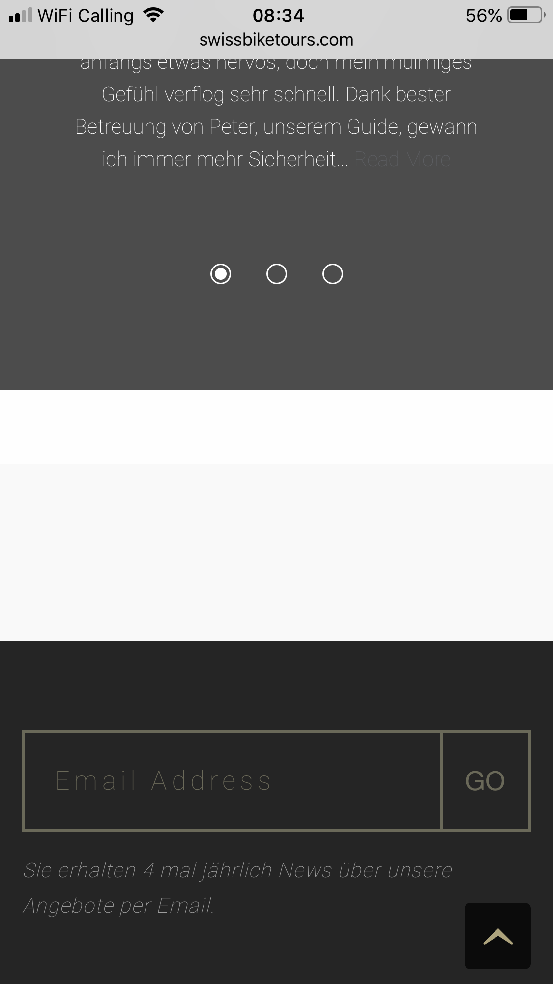
The Element can still be seen.
I tried it with custom CSS
/* Hide on Mobile*/
@media screen and (max-width: 720px){
        #hideonmobile{

         display: none;

       }
}
It was not working, in case I did not find a place with in the element to give in the new CSS class.
I would appreciate if you could give me a hint.
Thank you in advanced
Regards Peter