
Please add the following css in your custom CSS box inside Appearance > Customize and let me know if this resolves this issue for you.
@media only screen and (max-width: 557px)
.header-v1 .header-top {
    padding: 10px 0;
}
Thank you
Still the same, I added the css code you provide, clear the cache and cookie and history, refresh the browser. Nothing change.
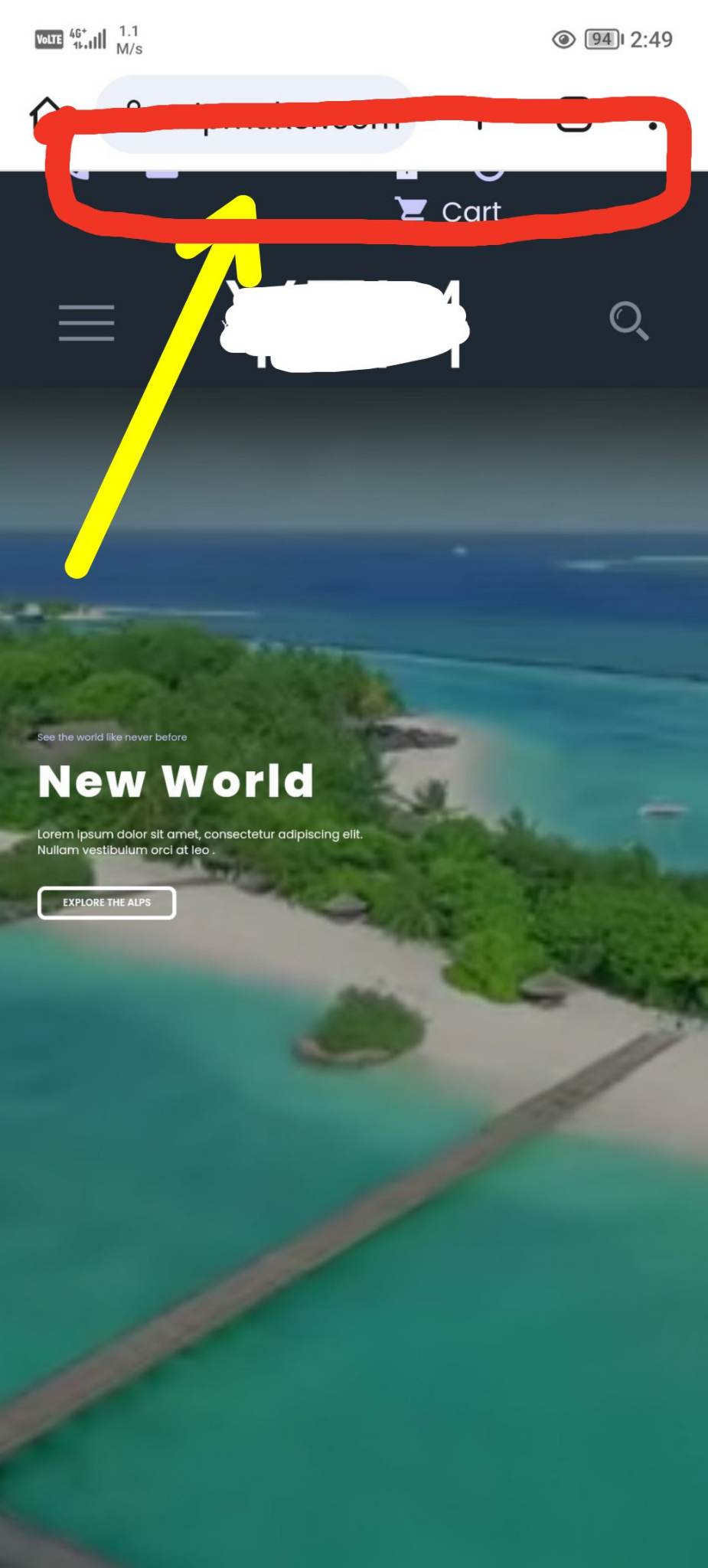
only ios device is display okay, android device will cut off.

Ok, can you please tell me phone model.
honor x9 5G
xiaomi 11T pro
samsung galaxy 10
Still waiting for solution…tq